Bernd & Hilla BecherFondazione MAST, Bologna. 23 April to 27 September 2026
Curators: Gabriele Conrath-Scholl / Urs Stahel
1/9
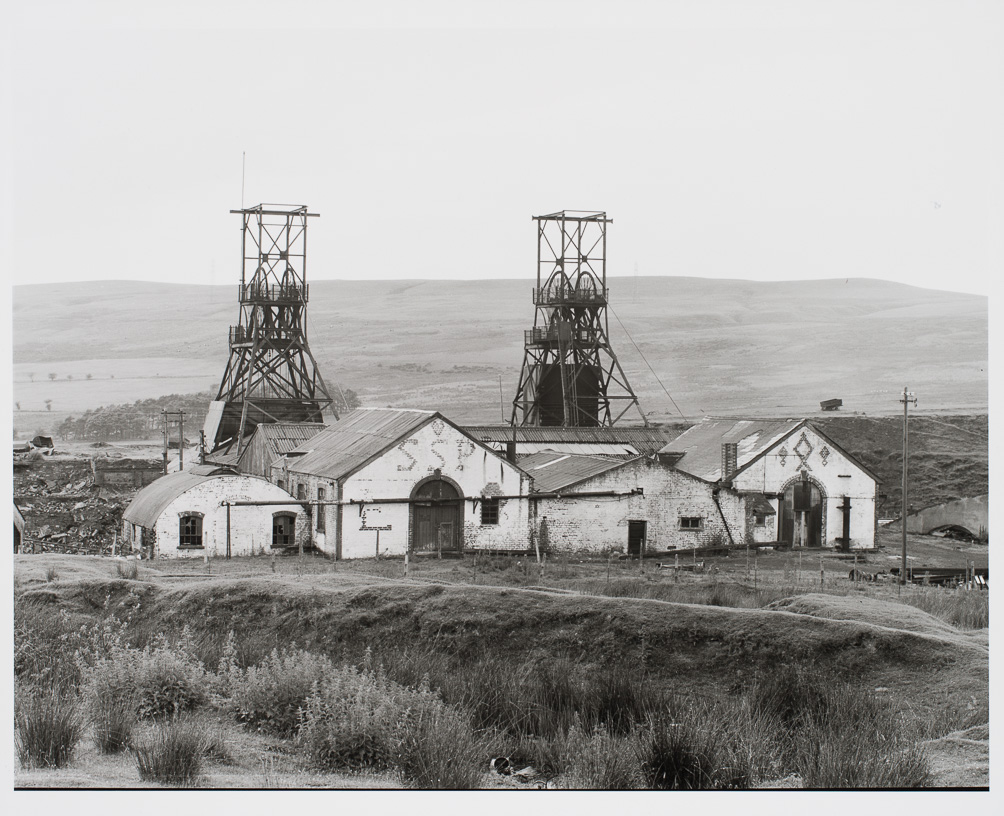
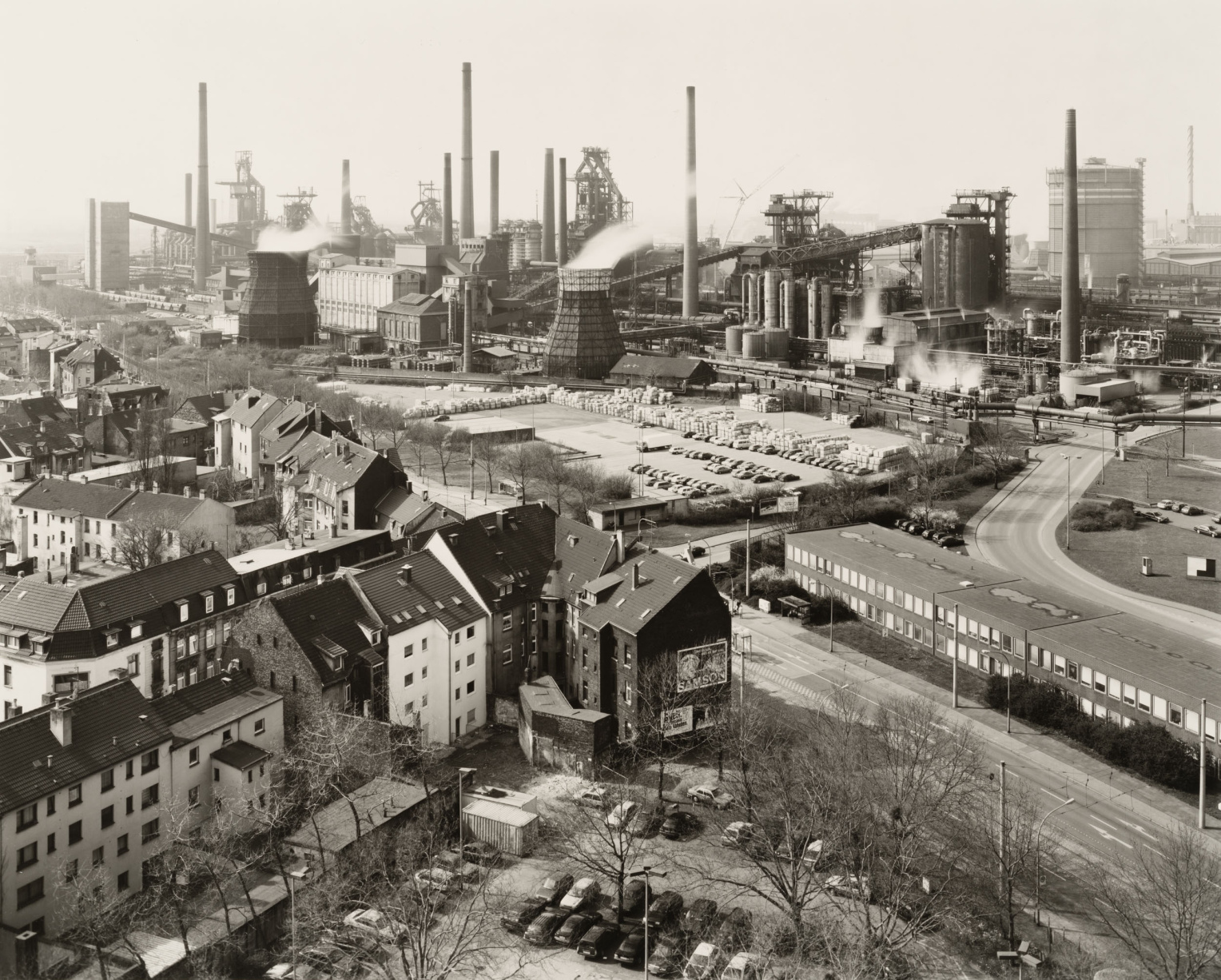
Starting in 1960, the first of the factories in Europe—built up over a hundred years and mostly running at full speed—began to slowly falter. Production was either relocated, first to Southern Europe, then Eastern Europe, and finally to Asia, or simply shut down entirely. Once-proud factories with well-known, glittering names and successful products were dissolved, individual divisions sold off, and new conglomerates and holding companies assembled from the remaining assets. Following automation and the first steps toward globalization, digitization and the associated new business models broke the backs of many European factories.
Read More…
These major restructurings dealt a double blow to industrial photography. Immediately, the photo departments in the existing factories were downsized or dissolved. Any financial expenditure for this precise documentation suddenly seemed too great. The second step followed at the latest when the factory was sold. Often, the photo archives of industrial firms were disposed of by the new owner or the new ownership structure—by the container load. There was scarcely any interest left in the company’s history, origins, or culture; no curiosity remained for glass plates or the rich detail of large-format photography measuring 13x18 cm or 8x10 inches. Thus, an extensive and unusual photographic realm—a central branch of photography, photographic history, and the visualization of industrialization—was lost in a relatively short time.
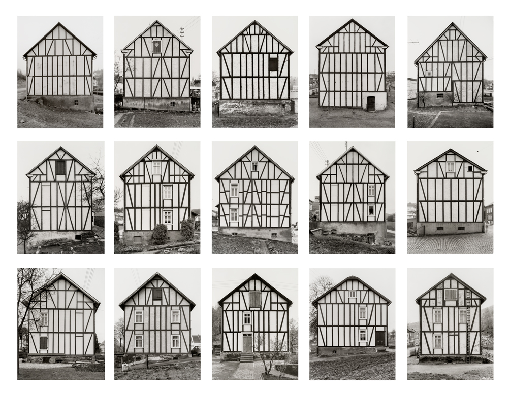
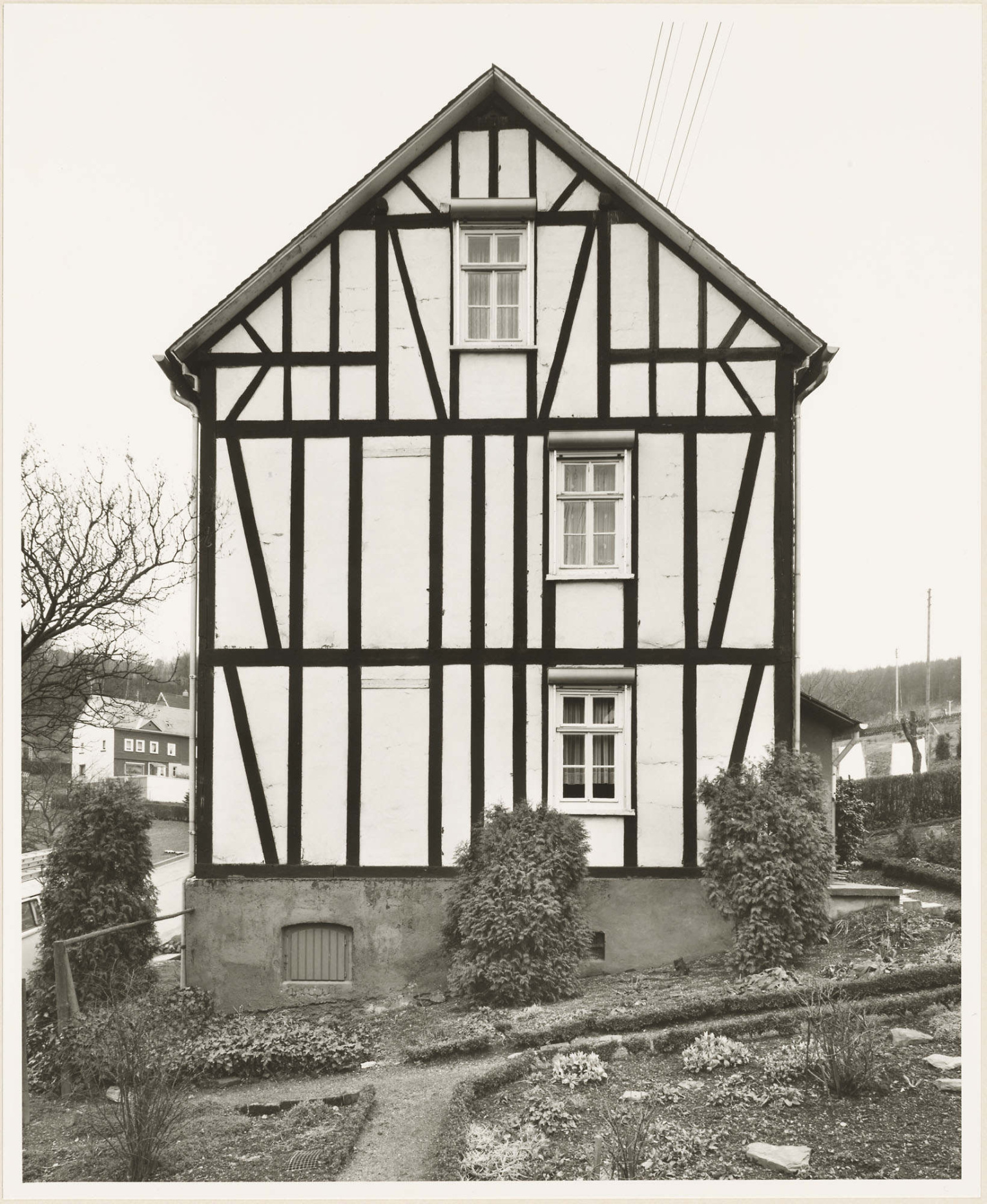
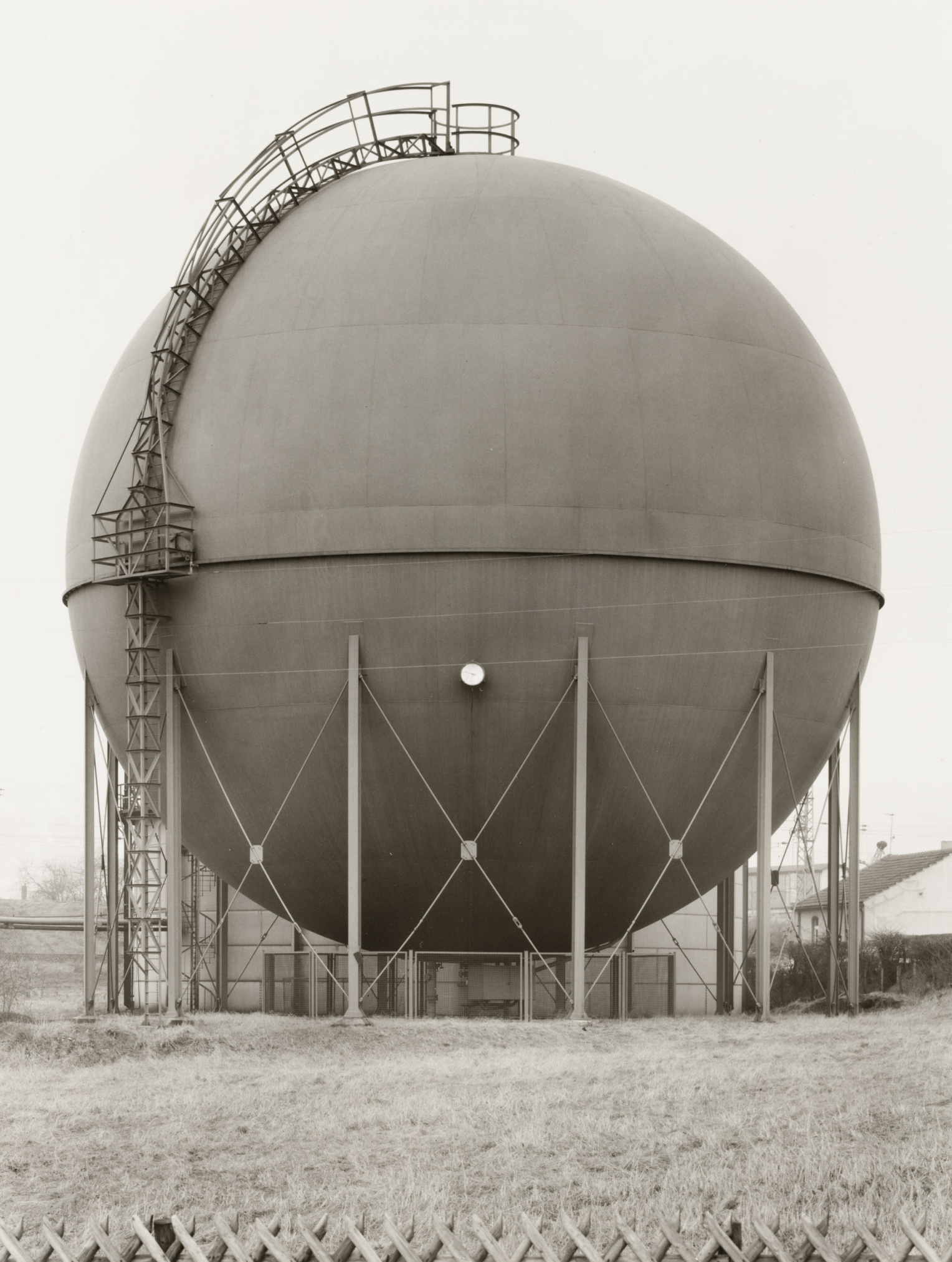
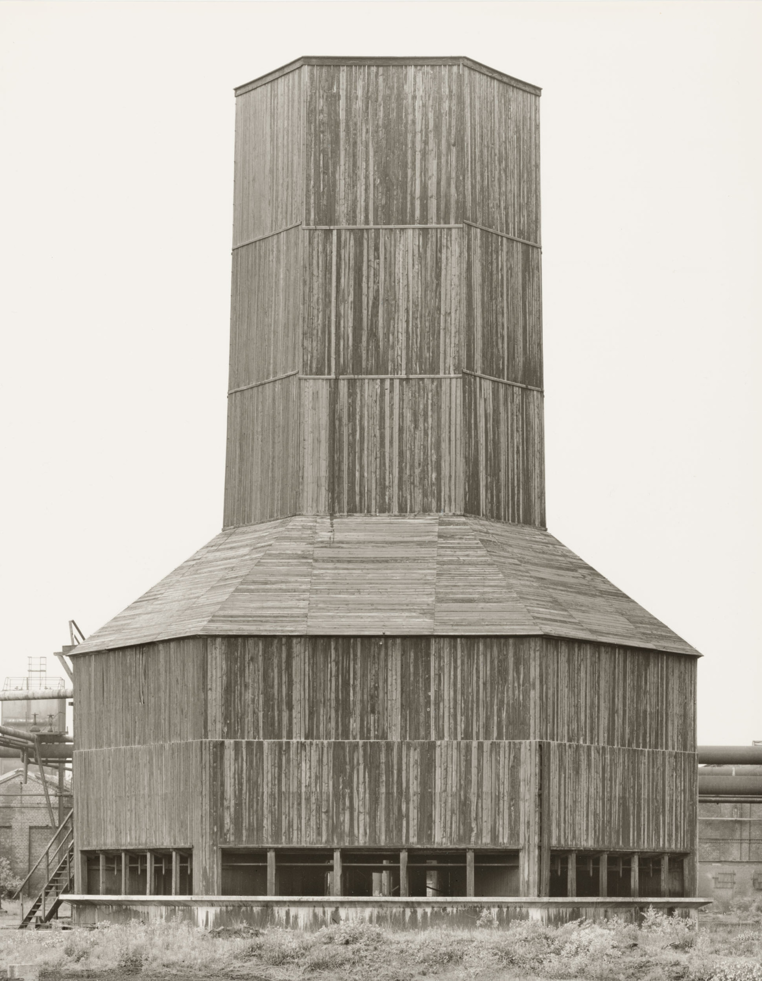
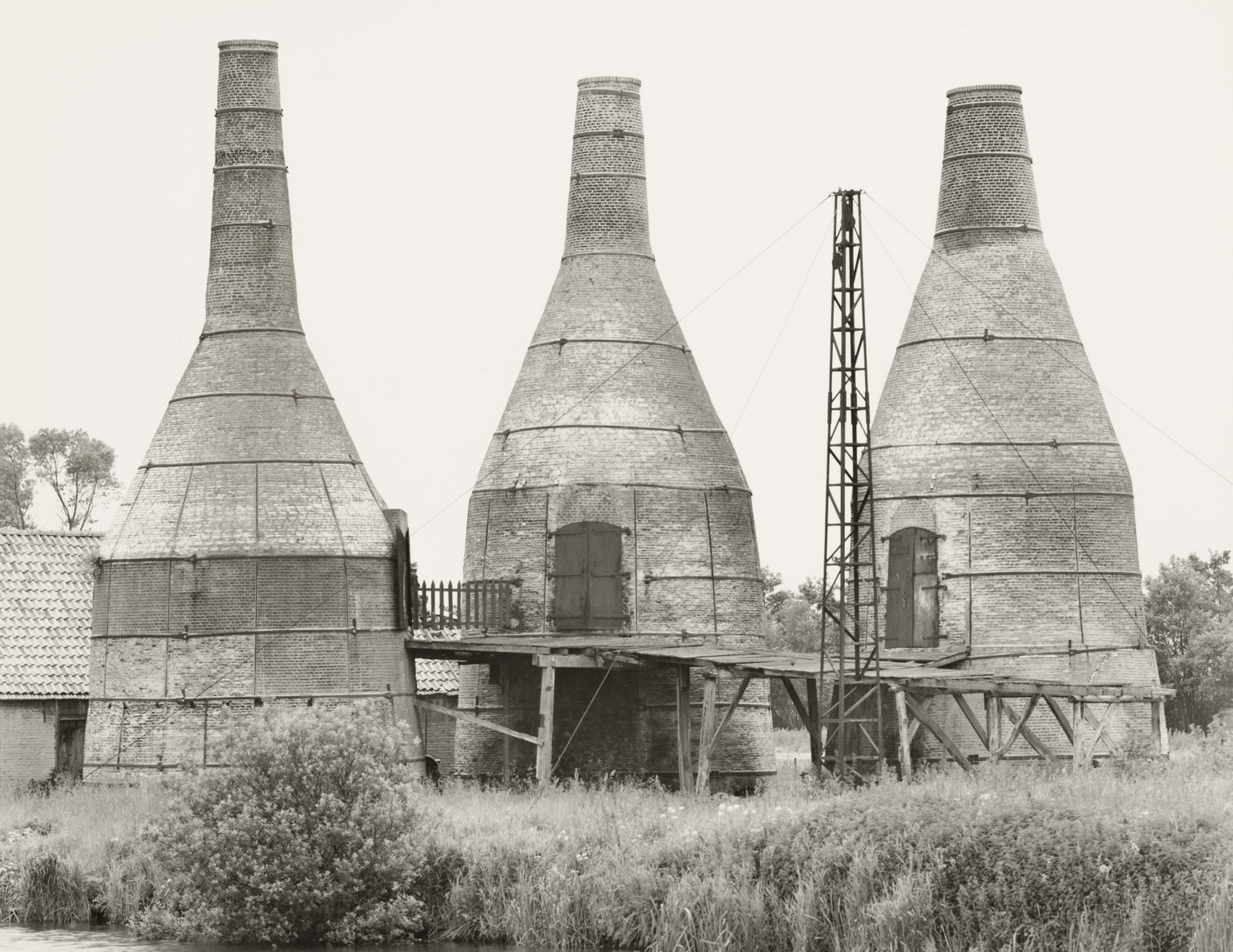
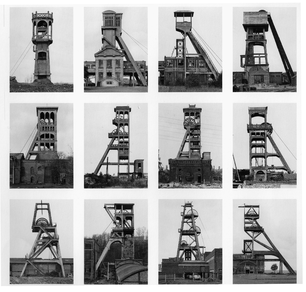
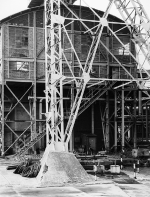
This made the Bechers’ work all the more important! The artist couple Bernd and Hilla Becher (1931–2007/1934–2015) made photographic history with their work. Through their collaborative body of work, which they developed from 1959 through the early 2000s in Germany, the Benelux countries, the United Kingdom, France, Italy, the United States, and Canada, they pioneered a new, artistically motivated documentary style. Against the backdrop of New Objectivity photography, but also following in the footsteps of 19th-century descriptive photography, they adopted a neutral, consistently maintained representational method that resonated particularly strongly in many respects, including within the contexts of Minimal Art and Conceptual Art.
The exhibition presents, for the first time in Europe and in such detail, the methodological and thematic breadth of the couple’s oeuvre with over 300 original black-and-white photographs and other exhibits. The exhibits come from the Bernd and Hilla Becher Archive at the Photographic Collection / SK Stiftung Kultur and the Bernd & Hilla Becher Studio, Düsseldorf, in collaboration with Max Becher under the supervision of the Bernd & Hilla Becher Estate. In addition, there are loans from Sprüth Magers as well as from the LVR-Landesmuseum Bonn.
The exhibition was organized by the Photographische Sammlung / SK Stiftung Kultur in Cologne, in cooperation with the Bernd & Hilla Becher Studio, Düsseldorf, and adapted here in collaboration with the Fondazione MAS.
Curated by Gabriele Conrath-Scholl, in Bologna in collaboration with Urs Stahel.
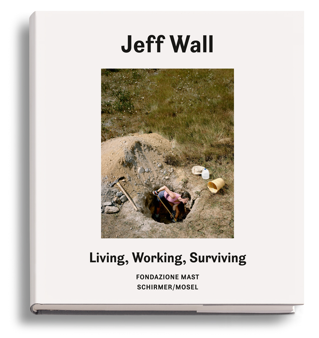
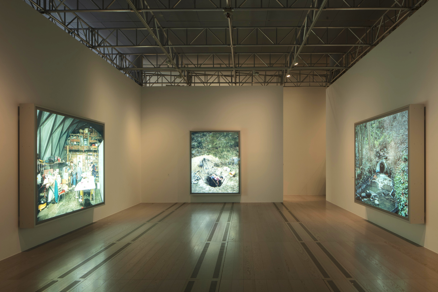
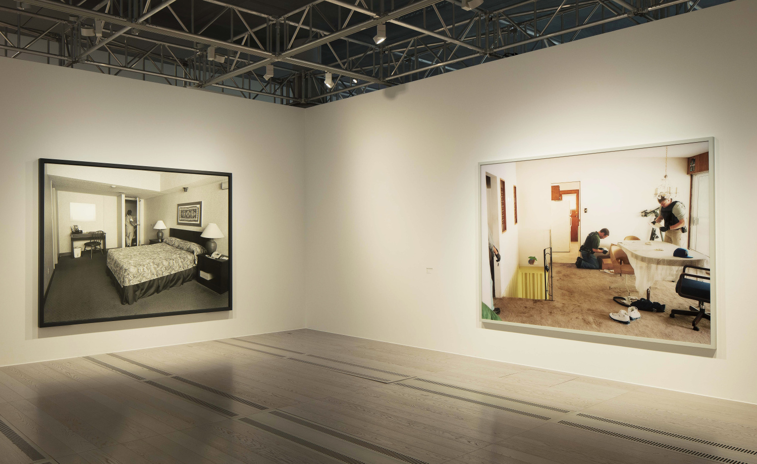
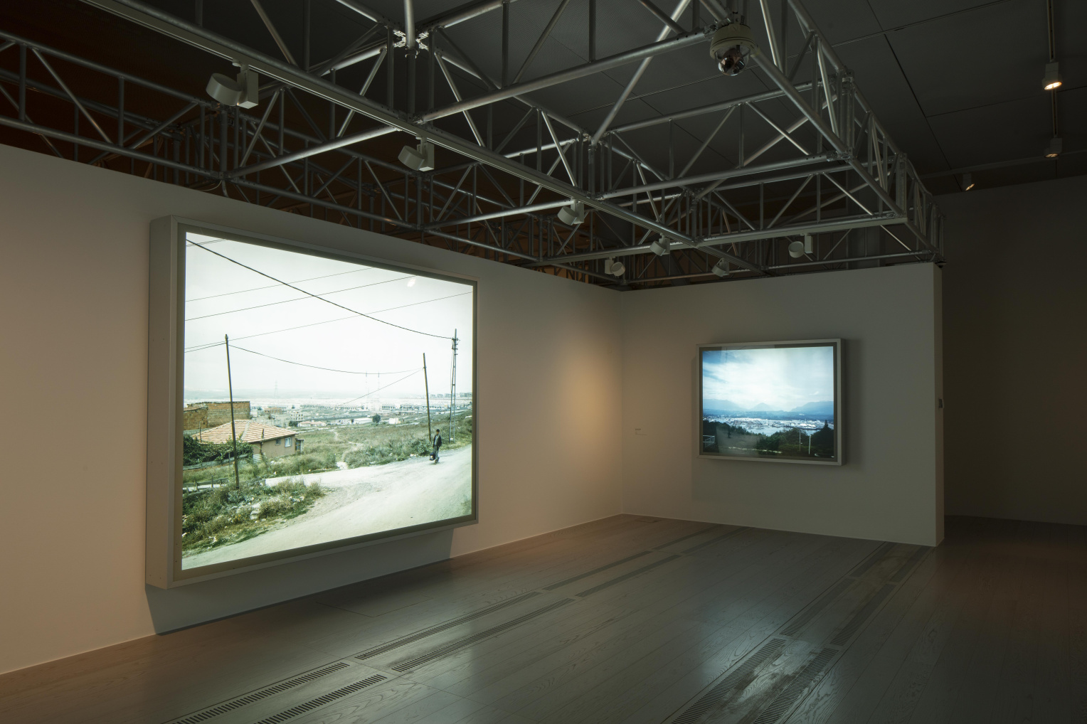
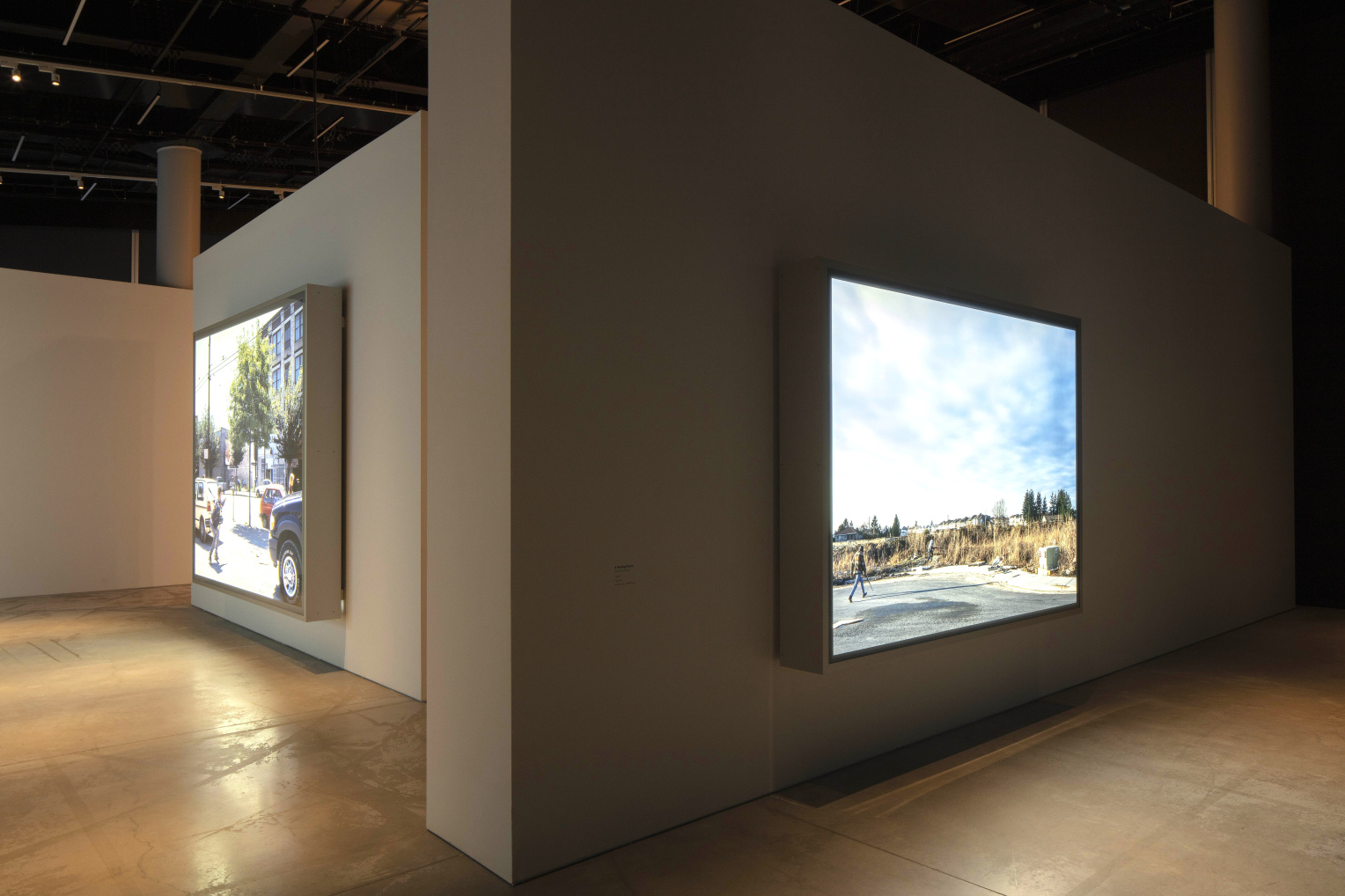
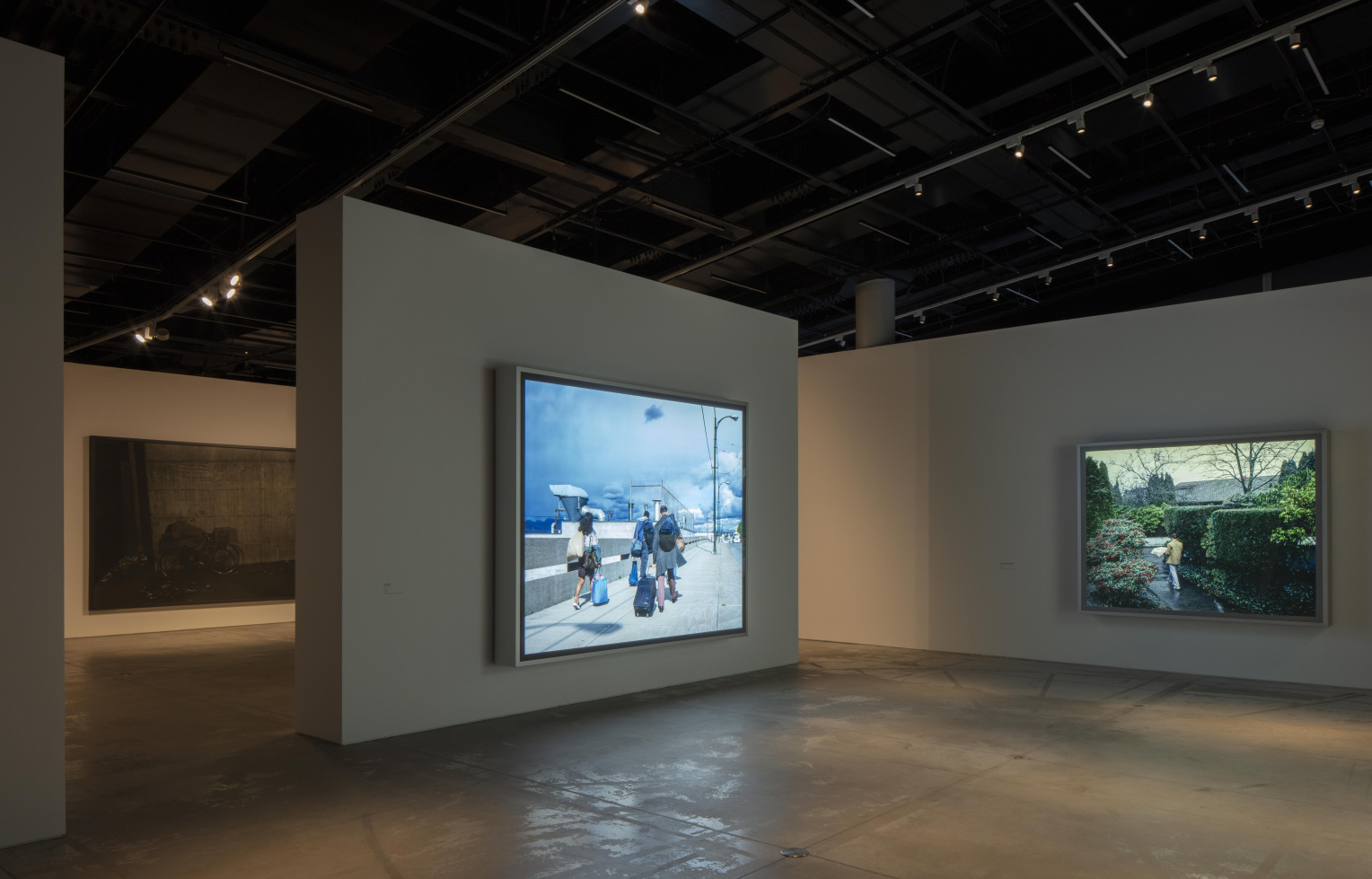
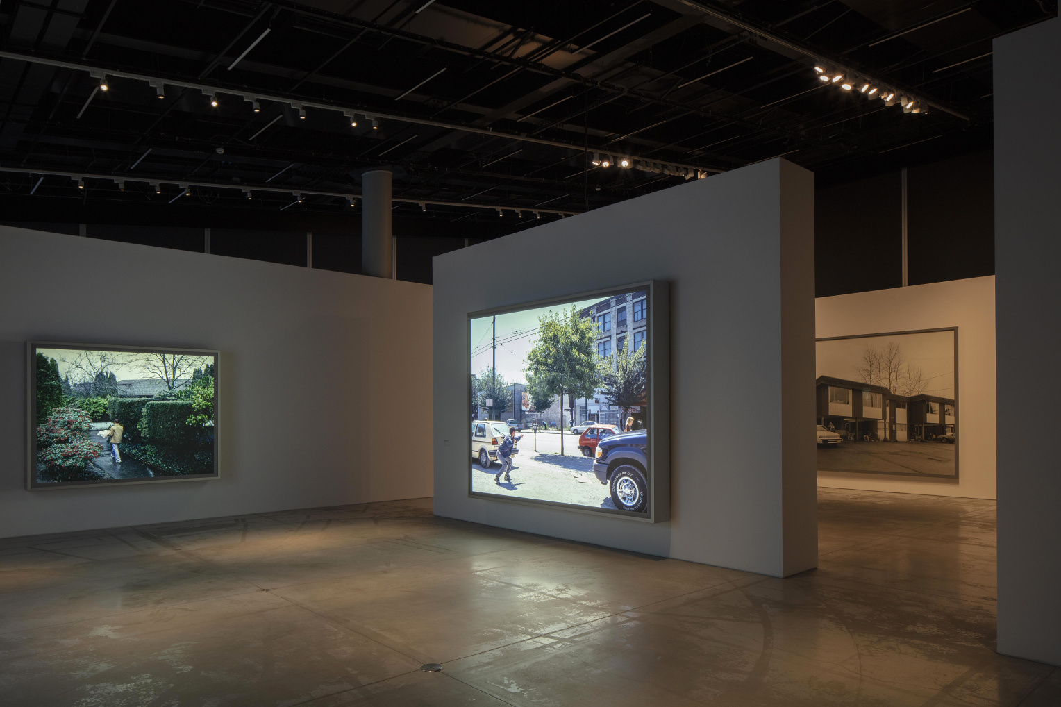
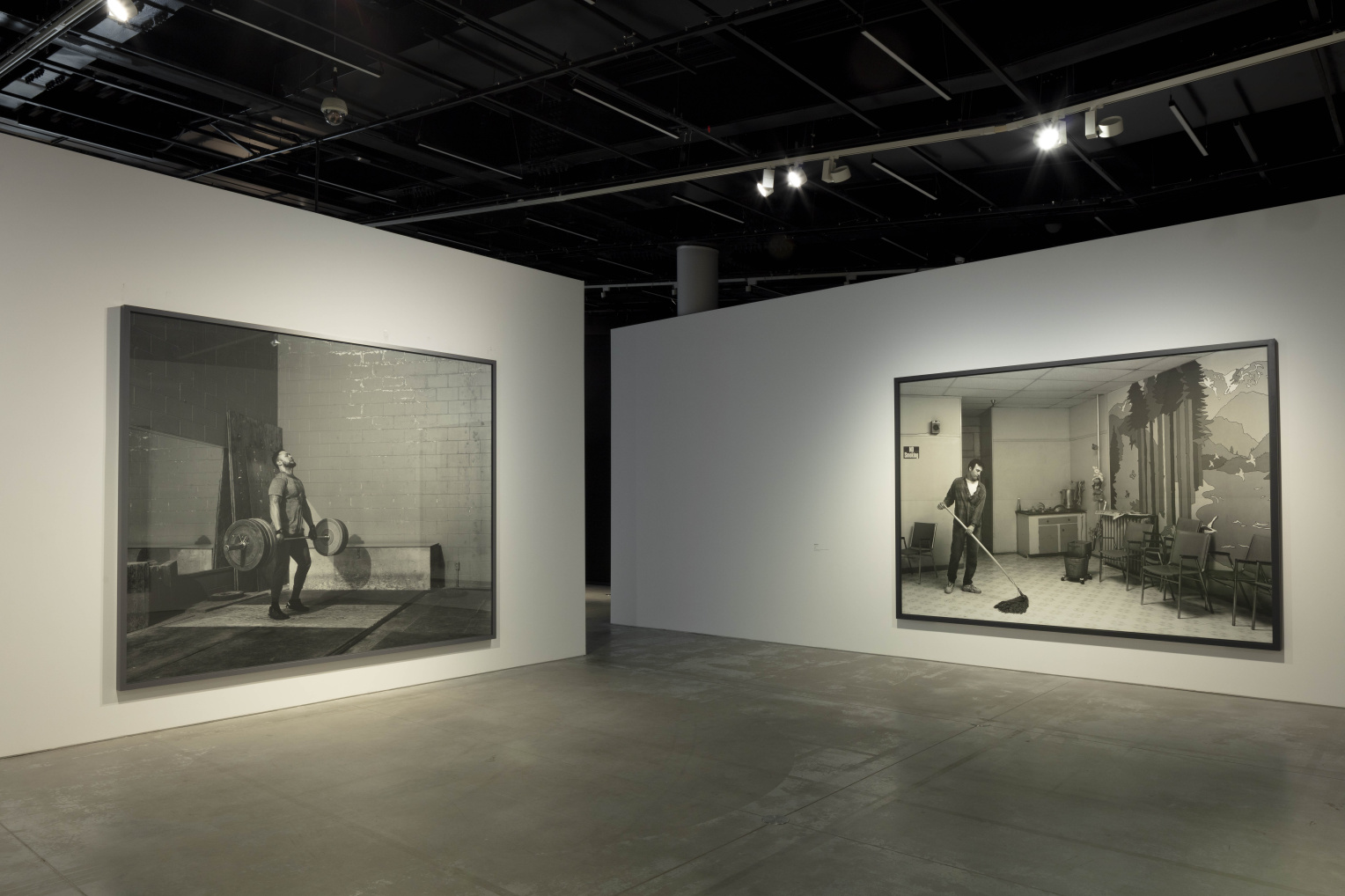
Jeff Wall was born in 1946, in Vancouver, where he still lives and works. His photographs have been exhibited worldwide over the past forty years. His pictures often depict events the artist has witnessed and reconstructed in a process he calls “cinematography.” His subject matter ranges from everyday occurrences photographed in real places to imaginary situations composed in a studio. Jeff Wall is considered to be a central artist, who since the 1970s has led the way in emphasizing the affinities between photography, painting, and cinema. He taught art at universities in Canada for twenty-five years, and his critical writing has been collected and published in several languages. His work has been the subject of numerous and important retrospective exhibitions around the world. More recently at the Beyeler Museum in Basel last year, the MAAT in Lisbon or now, parallel, at the Galleria d’arte in Torino. And now at Fondazione MAST in Bologna.
Text: Urs Stahel. 96 pages, 28 images. Hardcover.
New Essays
1/15
Yann Mingard, Indociles
Yann Mingard, Indociles
Yann Mingard, Indociles
Yann Mingard, Indociles
Andreas Gursky
"The viewer writes the poem that the artist has erased in the process of making the picture." - Living, Working, Surviving in Pictures by Jeff Wall. Schirmer&Mosel, 2025
Als die Welt noch real war. Eine Rückschau in die Zukunft. Walter Moser (Hg.): «Festschrift Monika Faber». Eigenverlag, Wien, 2024. Und, abgeändert in: re-vue.org (2025)
Ruth Erdt - Dancing on the Periphery (Schwamendingen), Steidl 2024
Ruth Erdt - Tanz im Randbezirk (Schwamendingen), Steidl 2024
When Images Learn to Speak - on conceptual photography of the Astrid Ullens collection, 2024
Vertigo - Scenarios of Rapid Change, MAST 2024
Pouvoir et souffrance, in: Yann Mingard: Les Indociles, GwinZegal 2023 Macht und Schmerz (zu: Yann Mingard: Les Indociles, GwinZegal 2023)
Andreas Gursky - Visual Spaces of Today (2023)
Andreas Gursky - Visuelle Räume der Gegenwart (2023)
F&A - A Few Fantasies, A Few Aberrations (Photography and Architecture) (2022)
New ReadEcology and Technology
On Emidio Battipaglia’s Synaptic Dialogues
1/3
We are at a critical juncture. Our lives as human beings for the past 5–10,000 years, since we first constructed settlements, have brought us to a point where we are facing problems that we cannot readily solve—or even ever solve. Using the capacities that define us as human beings—our powers of comprehension and reasoning—we in the West have created a world that we no longer seem able to control, despite those same powers of reasoning. Human beings are part of nature, yet they reason that they are superior to it. What’s more, given this belief that humankind is more important than nature, backed up by the Old Testament notion of dominium terrae[i] (dominion over the Earth), human beings have persistently subjugated nature. A long drawn out, ultimately painful, even fatal double bind.
Read More…
Nowadays we recognize that we are living in a world that we have largely fashioned ourselves. The dualism of humankind and nature, as we know it in the West, is ebbing away in the realization that the natural world we now inhabit is not “natural” any more, nor is it “another nature.” It has become our nature—precisely because we have so radically altered it, reshaping and cultivating it, transforming and appropriating it, inscribing our will, our desires, our hubris into it. Week after week the total weight of what we produce exceeds the entire weight of humankind. The expectation is that by 2040 the sum total of all that humankind has produced will outweigh all of the Earth’s natural features.[1] At the same time, in just a few decades we can use up raw materials that nature has taken millions of years to produce. Concrete and plastic—our everyday materials—now pervade all kinds of sediments. The knock-on effect is so extreme that these days microplastics are omnipresent, even in our “origins”: not only in the sources of our rivers, but in our own brains, too.
At last, very late in the day, we are starting to realize that we have become a major, potentially crucial geologic factor. Accordingly, around two decades ago the term Anthropocene started to gain traction as a designation for the present epoch, which is primarily characterized, even dominated by the impact of humankind.[2] The exploitation of nature, its transformation, is now so extensive that life on our planet is being fundamentally redefined. The global population explosion, from one billion around 1800 to eight billion two hundred years later, in tandem with huge technological advances and an economic system that is constantly, incessantly urging us to buy and throw away, has led to the Great Acceleration,[3] that is to say, a gigantic, perilous increase in human activity. At the same time others talk in terms of the Capitalocene (Jason W. Moore), pointing to the fact that the “benefits” of that exploitation have been privatized and the costs and the consequences are borne by wider society. In other words, taking a historical, global view, for the last 250 years the Western world has siphoned off the profits of exploitation and has imposed the costs on the rest of the world, above all the Global South.
In the early modern era res cogitans and res extensa (res: the thing or matter, cogitans: thinking, questioning, and extensa: extended) were the core concepts in the dualism expounded by René Descartes. This ontological distinction between “thinking substance” and “extended substance,” between mind and matter, decisively affirmed the precedence given to human self-interest over nature. Consequently we have long exploited nature and are still doing so today.[4] How can we—supposedly rational human beings—have allowed things to come to this? Unfortunately, as the philosopher and theologian Gert Scobel recently remarked, reason is not our only faculty: our senses, desires, determination, search for happiness, greed (and morality laws) often contribute much more than pure reason to the decisions we make.[5]
So we are at a turning point and have to ask ourselves: Where do we go from here? Can we still change course? How can we save our own lives and other lives on this planet? The answers to these questions are as diverse as humankind. Yet three main responses come to the surface. 1. The response from the fatalists and the cynics: They will continue as they are, because they believe that we can’t change anything anyway, and because any such action would be too detrimental to their own lives. 2. The response from the self-critical, moralizing cohort: They admit that we human beings are neither omniscient nor unique; on the contrary, we should recognize that nature has its own purpose, its rights and will, that it is not merely a fund of raw materials and a garbage dump. 3. And the response from the optimists, including the techno-optimists: They agree that, yes, using our powers of reasoning we have created problems that are now beyond us. But perhaps we have also already created precisely the technologies that—surpassing our own intellectual powers—may assist us in finding a way out of this predicament. Perhaps new technologies, such as AI, will help us to develop instruments that will set the right course in and for the future of our planet.
This third category is the backdrop to Synaptic Dialogues, Emidio Battipaglia’s project for A New Gaze 4. He introduced his submission with a clear, unequivocal statement: “In the pursuit of a sustainable and thriving future, Synaptic Dialogues investigates the powerful synergies formed through cooperation between human and non-human agents. By fostering collaboration among diverse entities, such as humans, technology, and the environment, the project illuminates the transformative potential of these interconnected relationships. As novel, symbiotic communities emerge, they contribute to a collective sense of belonging, inclusivity, and shared purpose, all of which are vital for addressing pressing global challenges.”[6]
Battipaglia has constructed a dynamic situation combining a natural system and an artificial system: the ensuing merger is controlled by both human and non-human forces. The model he has created alerts the viewer to the fine, fragile balance between technological progress and the need to protect the world’s ecosystems—a model that can potentially demonstrate new ways forward. In concrete terms Battipaglia juxtaposes the natural, self-sufficient (endangered) system of the Brazilian rainforest with the artificial system of AI server farms in a data center. To this end he took photographs in the rainforest (as it happens during an unusually protracted drought in the fall of 2023) and in a data center. He then fed these images into an AI program that generated new images—mutations of the rainforest and the data banks, composites and midway hybrids, or rather, summations of natural and artificial forms. These images are on view in the exhibition together with an installation of plants that react to the presence and touch of human beings. The reactions of the plant systems are recorded and projected onto the wall.
In the newly generated images wire mesh structures, server cabinets, and bundles of data-center cables mingle with the organic forms of climbing and trailing tropical vegetation from the rainforest. Geometric lines take on plant-like features and vice versa, which in turn leads to a new formal language of motifs that may later evolve into a new way of thinking. Harsh juxtaposition becomes togetherness, interconnecting and communal. Server modules stand tall like temples in a jungle, and wire mesh storage units allowing the air to freely circulate become balcony gardens, even botanical gardens. At the same time different color spectrums intermingle. Cold, hard, glowing colors from the world of synthetics and plastics come up against soft, warm colors and gentle blended greens from the rainforest. These colors and shapes symbolize different intelligences. As Emidio Battipaglia has put it: “The title "Synaptic Dialogues" mirrors the project's emphasis on interconnectedness and communication between human and non-human agents, referencing synapses—the junctions between nerve cells that facilitate information transmission. The dialogues in this project evoke synaptic connections, accentuating the importance of collaboration and co-creation in generating innovative artistic expressions and solutions to environmental challenges.”[7]
As viewers we find that we ourselves influence the installation and we discover that different intelligences and processing systems are intertwining here. This networked thinking and these thoughts about networks are now regarded by some leading lights as central, even crucial to our ability not only to understand the world today but also—more importantly, if we still want to avert a climate catastrophe—as crucial to our ability to change the world, to instigate better changes, to undergo change ourselves. In his latest book, Ways of Being: Beyond Human Intelligence,[8] the British artist and writer James Bridle presents the reader with an unfamiliar, unconventional view of the world—a view that no longer distinguishes between nature and technology. In his view intelligence is not confined to what human beings and some machines do. On the contrary, it is up to us to recognize the impressive, truly incomprehensible diversity of intelligent forms that exist on our planet, from mimosas and gibbons to crab computers and satellites, and hence to question the overvaluation of human intelligence. For Bridle everything ultimately comes down to one thing: How can we build a livable future, a world in which trees, animals, fungi, human beings and AI can peacefully coexist and communicate with one another on a deep level? And, one might add, how can we, as a functioning community, grasp reality as a whole and act accordingly?
Will such bold, compelling views—some of which originated centuries ago, but have never been taken seriously—be acted upon in time? For sure, in Emidio Battipaglia’s installations. But in The World, that much bigger installation, it is vital that views of this kind go hand in hand with behavioral change. Because presumably in the end this is purely a matter of to be or not to be, plain and simple: Change your ways, or die. So does that actually mean that the self-critical cohort and the techno-optimists should join forces?
Translated from the German by Fiona Elliott [1] https://www.3sat.de/wissen/scobel/scobel---mit-widerspruechen-leben-100.html (Accessed April 21, 2024). [2] The term Anthropocene, proposed as the name for a new geochronological epoch during which human beings have become the dominant influence on biological, geological and atmospheric processes on Earth, is derived from the Greek ἄνθρωπος ánthropos (human being) and καινός kainós (new). In 2024 the International Commission on Stratigraphy approved the vote to reject “the proposal for an Anthropocene Epoch as a formal unit of the Geologic Time Scale.” https://stratigraphy.org/news/152 (Accessed April 23, 2024). [3] Will Steffen et al., Global Change and the Earth System: A Planet Under Pressure (The IGBP Book Series) (Berlin, Heidelberg, and New York: Springer, 2004). [4] https://www.spektrum.de/lexikon/philosophie/res-cogitans-es-extensa/1782 (Accessed April 20, 2024). [5] https://www.3sat.de/wissen/scobel/scobel---mit-widerspruechen-leben-100.html (Accessed April 21, 2024). [6] Unpublished project papers, 2023. [7] Ibid, 2023. [8] James Bridle, Ways of Being: Beyond Human Intelligence (London: Allen Lane, 2022).